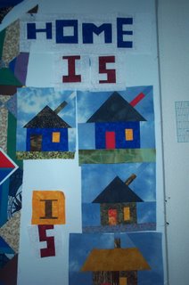
Here are the new letters. I don't know why the E always turns out so huge. I guess it's not a problem but the next time I am going to try to make a small one. I think I prefer the white
 background. The next word is WHERE so I will have a chance to try smaller E's.
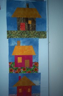
And a closer view of the last three houses I did. Too bad the door on the orange one doesn't have more contrast but maybe I can fix that when I quilt it.
4 comments:
Joyce, I am loving your wonky houses and lettering! I am very anxious to try both of those techniques. Thanks for sharing.
This going to be so cute. It is coming along nicely.
I like the low contrast door. I can see it just fine.
But speaking of contrast, where are you thinking of putting the letters with the white background? Seems like a lot of attention goes right to that background.
When you're working with a white design wall it's hard to see how stark the white is that you're using. I ran into a similar problem when I was putting my letters onto a purple background - the limited amound of purple I was using looked fine that way. But as soon as I moved all the blocks over onto white - all of a sudden I realized I had a problem.
This is something you might want to try: take all the blocks and lay them out on a different color. Something gray or tan or khaki... Do those letters jump out at you now? Take a picture and in a program (I highly recommend Picasa, a free download from Google) look at the pic in black and white.
I liked how your first letters worked WITH the houses.
You stick to your guns tho. Do whatever makes YOU happy.
Thanks for the hints Tonya. I have a gray floor so I will try arranging the houses and letters on the floor. If the white looks too stark I can overdye them . Actually that might be quite nice because the white is a white-on-white printed muslin and when I tried dyeing a piece of it the little patttern stayed white. It was very interesting. Soo many options! THat's what I love about quilting.
Post a Comment