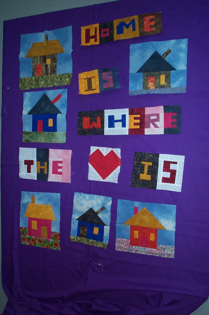
 Today I finished the letters and the houses. Tonya, I agreed with you when I put the white letters on the gray floor. The white background was just too much. Also it was too boring making them all the same. I was able to take the I from IS and cut it down to a T in THE and the H and S were small enough to fit with the other letters. Now am trying out background fabrics.
I only tried the purple because I bought a lot of it for a different project and it didn't work on that one. Surprisingly I like it a lot in this wall hanging.
The second one I liked because it has tiny castles and stars and moons on it. Unfortunately, it's really too busy to work. Not sure if that comes across in the photo.
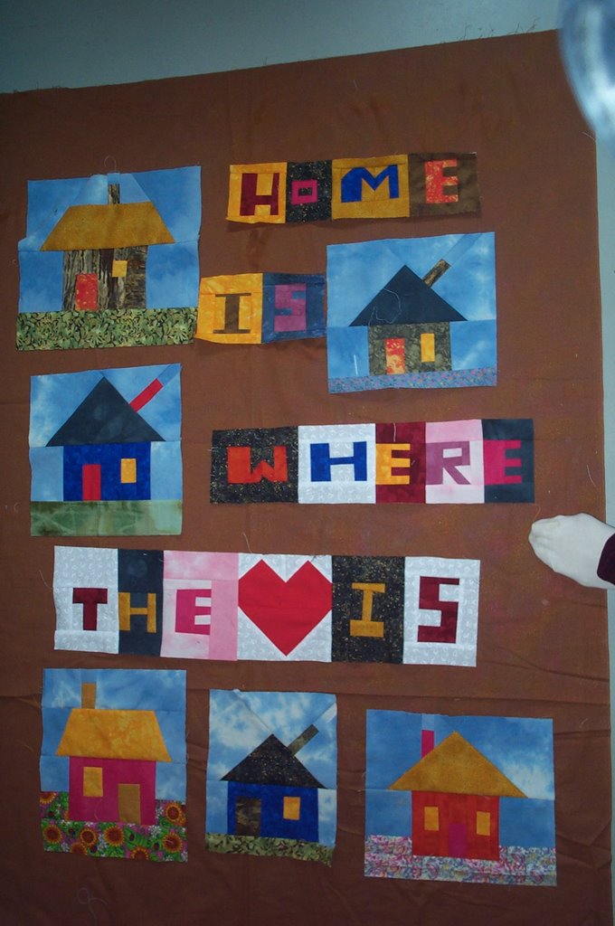
The brown has a bit of an opalescence to it that is nice but it seems maybe a bit bland.
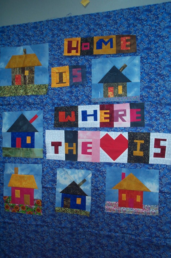
The last blue also has a bit of a sparkle to it. I was thinking of free-motion embroidering some words in the spaces between the houses too.
I also split the heart from the words in the purple one and it looks better. I may play around with the arrangement of the houses and letters a bit too.
This is such a fun stage. I have it on the floor because my design wall is covered with the string pieced top, hence the photo of my foot on the brown one.
2 comments:
This is nice, I am having a hard time deciding in I like the 2nd or 4th picture best. Your work is great.
I think the purple looks stunning - really brings out the colors incredibly well. The brown looks rich from here. I agree it all gets lost on that first blue. Love the idea of the embroidered words in the borders - gonna looks sooo great.
Post a Comment